Phylogenetics: APE Lab

|
EEB 5349: Phylogenetics |
| This lab is an introduction to some of the capabilities of APE, a phylogenetic analysis package written for the R language. You may want to review the R Primer lab if you've already forgotten everything you learned about R. |
Contents
Installing APE and apTreeshape
APE is a package largely written and maintained by Emmanuel Paradis, who has written a very nice book[1] explaining in detail how to use APE. APE is designed to be used inside the R programming language, which you are no doubt familiar with and was the subject of an earlier lab this semester (see Phylogenetics: R Primer). APE can do an impressive array of analyses. For example, it is possible to estimate trees using neighbor-joining or maximum likelihood, estimate ancestral states (for either discrete or continuous data), perform Sanderson's penalized likelihood relaxed clock method to estimate divergence times, evaluate Felsenstein's independent contrasts, estimate birth/death rates, perform bootstrapping, and even automatically pull sequences from GenBank given a vector of accession numbers! APE also has impressive tree plotting capabilities, of which we will only scratch the surface today (flip through Chapter 4 of the Paradis book to see what more APE can do).
APE is also the foundation for many other R package. apTreeshape is a different R package (written by Nicolas Bortolussi et al.) that we will also make use of today. Here are some examples of other R packages used in phylogenetics that depend on APE: phytools by Liam Revell, geiger by Matthew Pennell, and hisse by Jeremy Beaulieu and Brian O'Meara. The full list can be seen by looking at the "Reverse depends" section of the APE CRAN site.
None of the analyses we will do today are very computationally demanding, so I'll assume you are using R installed on your own laptop. I highly recommend using RStudio because it provides a nice interface to R that allows you to type commands, plot thinks, and get help all within one multi-paned application window.
If you haven't used APE or apTreeshape before, you will need to install them. Start R and type the following at the R command prompt:
> install.packages("ape")
> install.packages("apTreeshape")
Assuming you are connected to the internet, R should locate these packages and install them for you. After they are installed, you will need to load them into R in order to use them (note that no quotes are used this time):
> library(ape)
> library(apTreeshape)
You should never again need to issue the install.packages command for these packages again, but you will need to use the library command to load them whenever you want to use them.
Reading in trees from a file and exploring tree data structure
Download this tree file and save it as a file named yule.tre in a new folder somewhere on your computer. Tell R where this folder is using the setwd (set working directory) command. For example, I created a folder named apelab on my desktop, so I typed this to make that folder my working directory:
> setwd("/Users/plewis/Desktop/apelab")
(If you are using Windows, you'll need to use the Windows-style path with the backslashes rather than forward slashes.)
Now you should be able to read in the tree using this ape command (the t is an arbitrary name I chose for the variable used to hold the tree; you could use tree if you want):
> t <- read.nexus("yule.tre")
We use read.nexus because the tree at hand is in NEXUS format, but APE has a variety of functions to read in different tree file types. If APE can't read your tree file, then give the package treeio a spin. APE stores trees as an object of type "phylo".
Getting a tree summary
Some basic information about the tree can be obtained by simply typing the name of the variable you used to store the tree:
> t

Phylogenetic tree with 20 tips and 19 internal nodes.

Tip labels:
	B, C, D, E, F, G, ...

Rooted; includes branch lengths.
Obtaining vectors of tip and internal node labels
The variable t has several attributes that can be queried by following the variable name with a dollar sign and then the name of the attribute. For example, the vector of tip labels can be obtained as follows:
> t$tip.label
[1] "B" "C" "D" "E" "F" "G" "H" "I" "J" "K" "L" "M" "N" "O" "P" "Q" "R" "S" "T" "U"
The internal node labels, if they exist, can be obtained this way:
> t$node.label
NULL
The result above means that labels for the internal nodes were not stored with this tree.
Obtaining the nodes attached to each edge
The nodes at the ends of all the edges in the tree can be had by asking for the edge attribute:
> t$edge
      [,1] [,2]
 [1,]   21   22
 [2,]   22   23
 [3,]   23    1
   .     .    .
   .     .    .
   .     .    .
[38,]   38   12
Obtaining a vector of edge lengths
The edge lengths can be printed thusly:
> t$edge.length
 [1] 0.07193600 0.01755700 0.17661500 0.02632500 0.01009100 0.06893900 0.07126000 0.03970200 0.01912900
[10] 0.01243000 0.01243000 0.03155800 0.05901300 0.08118600 0.08118600 0.00476400 0.14552600 0.07604800
[19] 0.00070400 0.06877400 0.06877400 0.02423800 0.02848800 0.01675100 0.01675100 0.04524000 0.19417200
[28] 0.07015000 0.12596600 0.06999200 0.06797400 0.00201900 0.00201900 0.12462600 0.07128300 0.00004969
[37] 0.00004969 0.07133200
About this tree
This tree in the file yule.tre was obtained using PAUP from 10,000 nucleotide sites simulated from a Yule tree. The model used to generate the simulated data (HKY model, kappa = 4, base frequencies = 0.3 A, 0.2 C, 0.2 G, and 0.3 T, no rate heterogeneity) was also used in the analysis by PAUP (the final ML tree was made ultrametric by enforcing the clock constraint).
Fun with plotting trees in APE
You can plot the tree using all defaults with this ape command:
> plot(t)
Let's try changing a few defaults and plot the tree in a variety of ways. All of the following change just one default option, but feel free to combine these to create the plot you want.
Left-facing, up-facing, or down-facing trees
> plot(t, direction="l")
> plot(t, direction="u")
> plot(t, direction="d")
The default is to plot the tree right-facing (direction="r").
Hide the taxon names
> plot(t, show.tip.label=FALSE)
The default behavior is to show the taxon names.
Make the edges thicker
> plot(t, edge.width=4)
An edge width of 1 is the default. If you specify several edge widths, APE will alternate them as it draws the tree:
> plot(t, edge.width=c(1,2,3,4))
Color the edges
> plot(t, edge.color="red")
Black edges are the default. If you specify several edge colors, APE will alternate them as it draws the tree:
> plot(t, edge.color=c("black","red","green","blue"))
If you are bored, you can experimentally determine the order of edges by playing with edge widths and/or colors:
> nedges <- length(t$edge.length)
> widths <- c(2,3,4,rep(1, nedges-3))
> colors <- c("red", "green", "blue", rep("black", nedges-3))
> plot(t, edge.width=widths, edge.color=colors)
Voila! You can now see where the first 3 edges are in the tree!
Make taxon labels smaller or larger
> plot(t, cex=0.5)
The cex parameter governs relative scaling of the taxon labels, with 1.0 being the default. Thus, the command above makes the taxon labels half the default size. To double the size, use
> plot(t, cex=2.0)
Plot tree as an unrooted or radial tree
> plot(t, type="u")
The default type is "p" (phylogram), but "c" (cladogram), "u" (unrooted), "r" (radial) are other options. Some of these options (e.g. "r") create very funky looking trees!
Labeling internal nodes
> plot(t)
> nodelabels()
This is primarily useful if you want to annotate one of the nodes:
> plot(t)
> nodelabels("Clade A", 22)
> nodelabels("Clade B", 35)
To put the labels inside a circle rather than a rectangle, use frame="c" rather than the default (frame="r"). To use a background color of white rather than the default "lightblue", use bg="white":
> plot(t)
> nodelabels("Clade A", 22, frame="c", bg="white")
> nodelabels("Clade B", 35, frame="c", bg="yellow")
Adding a scale bar
> plot(t)
> add.scale.bar(length=0.05)
The above commands add a scale bar to the bottom left of the plot. To add a scale going all the way across the bottom of the plot, try this:
> plot(t)
> axisPhylo()
Diversification analyses
APE can perform some lineage-through-time type analyses. The tree read in from the file yule.tre that you already have in memory is perfect for testing APE's diversification analyses because we know (since it is based on simulated data) that this tree was generated under a pure-birth (Yule) model.
Lineage through time plots
This is a rather small tree, so a lineage through time (LTT) plot will be rather crude, but let's go through the motions anyway.
> ltt.plot(t)
LTT plots usually have a log scale for the number of lineages (y-axis), and this can be easily accomplished:
> ltt.plot(t, log = "y")
Now add a line extending from the point (t = -0.265, N = 2) to the point (t = 0, N = 20) using the command segments (note that the "segments" command is a core R command, not something added by the APE package):
> segments(-0.265, 2, 0, 20, lty="dotted")
The slope of this line should (ideally) be equal to the birth rate of the yule process used to generate the tree, which was  .
.
- Calculate the slope of this line. Is it close to the birth rate 10? answer
If you get something like 68 for the slope, then you probably used common logarithms rather than natural logarithms of 2 and 20. The plot uses a log scale for the y-axis, so the two endpoints of the dotted line are really (-0.265, log(2)) and (0, log(20)).
Birth/death analysis
Now let's perform a birth/death analysis. APE's birthdeath command estimates the birth and death rates using the node ages in a tree:
> birthdeath(t)
Estimation of Speciation and Extinction Rates
            with Birth-Death Models

     Phylogenetic tree: t
        Number of tips: 20
              Deviance: -120.4538
        Log-likelihood: 60.22689
   Parameter estimates:
      d / b = 0   StdErr = 0
      b - d = 8.674513   StdErr = 1.445897
   (b: speciation rate, d: extinction rate)
   Profile likelihood 95% confidence intervals:
      d / b: [-1.193549, 0.5286254]
      b - d: [5.25955, 13.32028]
See the excellent APE manual to learn more about the birthdeath function.
- What is the death rate estimated by APE? answer
- Is the true diversification rate within one standard deviation of the estimated diversification rate? answer
- Are the true diversification and relative extinction values within the profile likelihood 95% confidence intervals? answer
A "profile" likelihood is obtained by varying one parameter in the model and re-estimating all the other parameters conditional on the current value of the focal parameter. This is, technically, not the correct way of getting a confidence interval, but is easier to compute and may be more stable for small samples than getting confidence intervals the correct way.
- What is the correct way to interpret the 95% confidence interval for b - d: [5.25955, 13.32028]? Is it that there is 95% chance that the true value of b - d is in that interval? answer
- Or, does it mean that our estimate (8.674513) is within the middle 95% of values that would be produced if the true b - d value was in that interval? answer
Analyses involving tree shape
The apTreeshape package (as the name applies) lets you perform analyses of tree shape (which measure how balanced or imbalanced a tree is). apTreeshape stores trees differently than APE, so you can't use a tree object that you created with APE in functions associated with apTreeshape. You can, however, convert a "phylo" object from APE to a "treeshape" object used by apTreeshape:
> ts <- as.treeshape(t)
Here, I'm assuming that t still refers to the tree you read in from the file yule.tre using the APE command read.nexus. We can now obtain a measure of tree imbalance known as Colless's index:
> c <- colless(ts)
> c
[1] 44
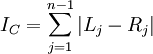
The formula for Colless's index is easy to understand. Each internal node branches into a left and right lineage. The absolute value of the difference between the number of left-hand leaves and right-hand leaves provides a measure of how imbalanced the tree is with respect to that particular node. Adding these imbalance measures up over all internal nodes yields Colless's overall tree imbalance index:
apTreeshape can do an analysis to assess whether the tree has the amount of imbalance one would expect from a Yule tree:
> colless.test(ts, model = "yule", alternative="greater", n.mc = 1000)
This generates 1000 trees from a Yule process and compares the Colless index from our tree (44) to the distribution of such indices obtained from the simulated trees. The p-value is the proportion of the 1000 trees generated from the null distribution that have indices greater than 44 (i.e. the proportion of Yule trees that are more imbalanced than our tree). If the p-value was 0.5, for example, then our tree would be right in the middle of the distribution expected for Yule trees. If the p-value was 0.01, however, it would mean that very few Yule trees are as imbalanced as our tree, which would make it hard to believe that our tree is a Yule tree.
- Does the p-value indicate that we should reject the hypothesis that a Yule process generated our tree? answer
You can also test one other model with the colless function: the "proportional to distinguishable" (or PDA) model. This null model produces random trees by starting with three taxa joined to a single internal node, then building upon that by adding new taxa to randomly-chosen (discrete uniform distribution) edges that already exist in the (unrooted) tree. The edge to which a new taxon is added can be an internal edge as well as a terminal edge, which causes this process to produce trees with a different distribution of shapes than the Yule process, which only adds new taxa to the tips of a growing rooted tree.
> colless.test(ts, model = "pda", alternative="greater", n.mc = 1000)
- Does the p-value indicate that we should reject the hypothesis that our tree is a PDA tree? answer
You might also wish to test whether our tree is more balanced than would be expected under the Yule or PDA models. apTreeshape let's you look at the other end of the distribution too:
> colless.test(ts, model = "yule", alternative="less", n.mc = 1000)
> colless.test(ts, model = "pda", alternative="less", n.mc = 1000)
- Does the p-value for the first test above indicate that our tree is more balanced than would be expected were it a Yule tree? answer
- Does the p-value for the second test above indicate that our tree is more balanced than would be expected were it a PDA tree? answer
You might want to see a histogram of the Colless index like that used to determine the p-values for the tests above. apTreeshape lets you generate 10 trees each with 20 tips under a Yule model as follows:
> rtreeshape(10,20,model="yule")
That spits out a summary of the 10 trees created, but what we really wanted was to know the Colless index for each of the trees generated. To do this, use the R command sapply to call the apTreeshape command colless for each tree generated by the rtreeshape command:
> sapply(rtreeshape(10,20,model="yule"),FUN=colless)
 [1] 38 92 85 91 73 71 94 75 72 93
- Why do you think your Colless indices differ from the ones above? answer
That's more like it! Now, generate 1000 Yule trees instead of just 10, and create a histogram using the standard R command hist:
> yulecolless <- sapply(rtreeshape(1000,20,model="yule"),FUN=colless)
> hist(yulecolless)
Now create a histogram for PDA trees:
> pdacolless <- sapply(rtreeshape(1000,20,model="pda"),FUN=colless)
> hist(pdacolless)
Use the following to compare the mean Colless index for the PDA trees to the Yule trees:
> summary(yulecolless)
> summary(pdacolless)
- Which generates the most balanced trees, on average: Yule or PDA? answer
apTreeshape provides one more function (likelihood.test) that performs a likelihood ratio test of the PDA model against the Yule model null hypothesis. This test says that we cannot reject the null hypothesis of a Yule model in favor of the PDA model:
> likelihood.test(ts)
- Does the p-value indicate that we should reject the hypothesis that our tree is a Yule tree? answer
Independent contrasts
APE can compute Felsenstein's independent contrasts, as well as several other methods for assessing phylogenetically-corrected correlations between traits that I did not discuss in lecture (autocorrelation, generalized least squares, mixed models and variance partitioning, and the very interesting Ornstein-Uhlenbeck model, which can be used to assess the correlation between a continuous character and a discrete habitat variable).
Today, however, we will just play with independent contrasts and phylogenetic generalized least squares (PGLS) regression. Let's try to use APE's pic command to reproduce the Independent Contrasts example from lecture:
| X | Y | Var | X* | Y* | |
| A-B | -6 | -4 | 2 | -4.24 | -2.83 |
| C-D | 2 | -6 | 2 | 1.41 | -4.24 |
| E-F | 11 | -237 | 21 | 2.40 | -51.7 |
In the table, X and Y denote the raw contrasts, while X* and Y* denote the rescaled contrasts (raw contrasts divided by the square root of the variance). The correlation among the rescaled contrasts was -0.63.
Enter the tree
Start by entering the tree:
> t <- read.tree(text="((A:1,B:1)E:10,(C:1,D:1)F:10)G;")
The attribute text is needed because we are entering the Newick tree description in the form of a string, not supplying a file name. Note that I have labeled the root node G and the two interior nodes E (ancestor of A and B) and F (ancestor of C and D).
Plot the tree to make sure the tree definition worked:
> plot(t)
> axisPhylo()
Enter the data
Now we must tell APE the X and Y values. Do this by supplying vectors of numbers. We will tell APE which tips these numbers are associated with in the next step:
> x <- c(26, 32, 19, 17)
> y <- c(-96, -92, 140, 146)
Here's how we tell APE what taxa the numbers belong to:
> names(x) <- c("A","B","C","D")
> names(y) <- c("A","B","C","D")
If you want to avoid repetition, you can enter the names for both x and y simultaneously like this:
> names(x) <- names(y) <- c("A","B","C","D")
Compute independent contrasts
Now compute the contrasts with the APE function pic:
> cx <- pic(x,t)
> cy <- pic(y,t)
The variables cx and cy are arbitrary; you could use different names for these if you wanted. Let's see what values cx and cy hold:
> cx
        G         E         F
 2.400397 -4.242641  1.414214
> cy
         G          E          F
-51.717640  -2.828427  -4.242641
The top row in each case holds the node name in the tree (the contrast is between the 2 descendants of this node), the bottom row holds the rescaled contrasts.
Label interior nodes with the contrasts
APE makes it fairly easy to label the tree with the contrasts:
> plot(t)
> nodelabels(round(cx,3), adj=c(0,-1), frame="n")
> nodelabels(round(cy,3), adj=c(0,+1), frame="n")
In the nodelabels command, we supply the numbers with which to label the nodes. The vectors cx and cy contain information about the nodes to label, so APE knows from this which numbers to place at which nodes in the tree. The round command simply rounds the contrasts to 3 decimal places. The adj setting adjusts the spacing so that the contrasts for X are not placed directly on top of the contrasts for Y. The command adj=c(0,-1) causes the labels to be horizontally displaced 0 lines and vertically displaced one line up (the -1 means go up 1 line) from where they would normally be plotted. The contrasts for Y are displaced vertically one line down from where they would normally appear. Finally, the frame="n" just says to not place a box or circle around the labels.
You should find that the contrasts are the same as those shown as X* and Y* in the table above (as well as the summary slide in the Independent Contrasts lecture).
Computing the correlation coefficient is as easy as:
> cor(cx, cy)
[1] -0.6342226
Phylogenetic Generalized Least Squares (PGLS) regression
Now let's reproduce the PGLS regression example given in lecture. Here are the data we used:
| X | Y | |
| A | 2 | 1 |
| B | 3 | 3 |
| C | 1 | 2 |
| D | 4 | 7 |
| E | 5 | 6 |
Enter the data as we did for the Independent Contrasts example:
> x <- c(2,3,1,4,5)
> y <- c(1,3,2,7,6)
> names(x) <- names(y) <- c("A","B","C","D","E")
> df <- data.frame(x,y)
In order to carry out generalized least squares regression, we will need the gls command, which is part of the nlme R package. Thus, you will need to load this package before you can use the gls command:
> library(nlme)
Let's first do an ordinary linear regression for comparison:
> m0 <- gls(y ~ x)
> summary(m0)
- What is the estimate of the intercept? answer
- What is the estimate of the slope? answer
Let's plot the regression line on the original data:
> plot(x, y, pch=19, xlim=c(0,6), ylim=c(0,8))
> text(x, y, labels=c("A", "B", "C", "D", "E"), pos=4, offset=1)
> segments(0, -0.4, 6, -0.4 + 1.4*6, lwd=2, lty="solid", col="blue")
You will have noticed that the first line plots the points using a filled circle (pch=19), specifying that the x-axis should go from 0 to 6 and the y-axis should extend from 0 to 8. The second line labels the points with the taxon to make it easier to interpret the plot. Here, pos=4 says to put the labels to the right of each point (pos = 1, 2, 3 means below, left, and above, respectively) and offset=1 specifies how far away from the point each label should be. The third line draws the regression line using the intercept and slope values provided by gls, making the line width 2 (lwd=2) and solid (lty="solid") and blue (col="blue").
To do PGLS, we will need to enter the tree with edge lengths:
> t <- read.tree(text="(((A:1,B:1)F:1,C:2)G:1,(D:0.5,E:0.5)H:2.5)I;")
You are ready to estimate the parameters of the PGLS regression model:
> m1 <- gls(y ~ x, correlation=corBrownian(1,t), data=df)
> summary(m1)
- What is the estimate of the intercept? answer
- What is the estimate of the slope? answer
- The corBrownian function specified for the correlation in the gls command comes from the APE package. What does corBrownian do? You might want to check out the excellent APE manual answer
- In corBrownian(1,t), t is the tree, but what do you think the 1 signifies? answer
Assuming you still have the plot window available, let's add the PGLS regression line to the existing plot (if you've closed the plot window you will have to recreate the plot first):
> segments(0, 1.7521186, 6, 1.7521186 + 0.7055085*6, lwd=2, lty="dotted", col="blue")
Finishing up
To get points for completing this lab email Katie an image of your plot with both the original regression line and the PGLS regression line. Based upon these two regression lines, briefly (1-2 sentences) summarize the relationship between these two traits.
Literature Cited
- ↑ Paradis, E. 2006. Analysis of phylogenetics and evolution with R. Springer. ISBN: 0-387-32914-5