Phylogenetics: R Primer

|
EEB 5349: Phylogenetics |
| This lab represents an introduction to the R computing language, which will be useful not only for today's lab, which explores the most common probability distributions used in Bayesian phylogenetics, but also for Phylogenetics software written as R extensions (i.e. APE). This lab also now includes a lab originally written by Kevin Keegan on using ggtree to create publication-quality tree plots. |
Contents
- 1 What is R?
- 2 Installing R
- 3 Installing RStudio
- 4 Creating plots using R
- 5 Exploring probability distributions using R
- 6 Plotting trees in R
- 6.1 Goals
- 6.2 Setup
- 6.3 Reading and storing a tree
- 6.4 Creating a circle tree with two clades highlighted
- 6.4.1 Plot the tree using all default settings
- 6.4.2 Adding/Altering Tree Elements with Geoms and Geom-Like Functions
- 6.4.3 Tip Labels
- 6.4.4 Saving to a PDF
- 6.4.5 Storing geoms in variables
- 6.4.6 Clean out your plot window periodically
- 6.4.7 Clade Colors
- 6.4.8 Clade Labels
- 6.4.9 Save the circle tree
- 6.5 Plotting a rectangular tree with bootstraps
- 6.6 Cite ggtree
- 6.7 Getting Help
- 7 References
What is R?

Installing R
Install the R package (if you haven't already) by going to http://www.r-project.org/ and following the download instructions for your platform. You will be doing this lab on your own laptop, not the cluster, because much of this lab involves plots, which are most easily generated and displayed on your own laptop. I have installed the latest version of R (which, at this moment, is version 3.6.2, nicknamed "Dark and Stormy Night"), but these instructions should work with slightly older versions of R.
Installing RStudio
We will use R via RStudio, which will allows you to manipulate R source code and see the results within the same application window. RStudio is a separate app that you can download from https://rstudio.com/products/rstudio/download/.
Creating plots using R
To use R, type commands into the console window at the R prompt (>). Try the following commands for starters. Note that I've started each line with the > character. That > character is the R command prompt: you should type in only what follows the > character. Also, you need not type in the # character or any characters that follow # on the same line. These represent comments in R, and will be ignored completely by the R interpreter.
> help()
> help(plot)            # get help on a particular topic
> help.search("gamma")  # search for all help topics that mention the word "gamma"
That last one will generate a confusing list of topics, some of which do not appear to have anything to do with the word "gamma"! Nevertheless, this search feature is good to know about if you are desperate for information about some topic for which the basic help command turns up nothing. (Google is also an excellent help search tool: start your Google search with a capital letter R followed by a keyword.)
Creating a histogram
Drawing 1000 standard normal deviates and creating a histogram is as easy as:
> y <- rnorm(1000, 0, 1) # let y be a list of 1000 random normal (mean 0, std. dev. 1) deviates
> y                     # view the stored standard normal deviates
> hist(y)               # create a histogram of the values stored in y
Note that "<-" means "assign to". You can also use an equal sign here, but you will be immediately flagged as an R newbie if you do that! Important time-saving hint: you can save a lot of typing by using your up-arrow to recall previously-issued commands. You can then modify the previously-issued command and hit the Enter key to submit the modified version.
Creating a plot
Let's begin by making a simple scatterplot using these data:
| x | y |
|---|---|
| 1 | 1 |
| 2 | 1 |
| 1 | 3 |
| 4 | 5 |
| 2 | 4 |
| 3 | 5 |
| 4 | 7 |
| 5 | 8 |
In the R console window, enter the data and plot it as follows (note that you should not type the initial > on each line; that's the R prompt):
> x <- c(1,2,1,4,2,3,4,5)
> y <- c(1,1,3,5,4,5,7,8)
> plot(x,y)
The "c" in c(...) means "combine", so the c function's purpose is to combine its arguments. Thus, both x and y are not single values, but instead each is a collection of 8 numbers. Collections of numbers like this are known as vectors in mathematics, or arrays in many computer programming languages (although in Python it would be called a list).
Modifying a plot
R does a fairly nice job of selecting defaults for plots, but I find myself wanting to tweak things. This section explains how to modify various aspects of plots.
Changing the plotting symbol
Use the pch parameter to change the symbol R uses to plot points:
> plot(x, y, pch=19)
Common values for pch include 19 (solid dot), 20 (bullet), 21 (circle), 22 (square), 23 (diamond), 24 (up-pointing triangle), and 25 (down-pointing triangle). The stroke and fill color for symbols 21-25 can be changed using the col and bg parameters. For example, to use red squares with yellow fill, try this:
> plot(x, y, pch=22, col="red", bg="yellow")
See the help topic on points for more info:
> help(points)
Plot type
The default plot type is "p" for points, but other plot types can be used (use the command help(plot) for details). Let's use the "l" (that's a lower-case L) type to connect our points with lines:
> plot(x, y, type="l")
Clearly, this is not something that you would want to do with these data, but we will use type="l" extensively later in this tutorial. To use both points and lines, set the type to both ("b"):
> plot(x, y, type="b")
Line width
To make the line connecting the points thicker, use the lwd option (lwd=1 is the default line width):
> plot(x,y,type="l",lwd=3)
Plot and axis labels
The xlab, ylab and main parameters can be used to change the x-axis label, the y-axis label and the main plot title, respectively:
> plot(x, y, type="l", xlab="width", ylab="height", main="Leaf width vs. height")
Losing the box
The bty parameter can be set to "n" to remove the box around the plot:
> plot(x, y, type="l", bty="n")
Losing an axis
The xaxt and yaxt parameters can be set to "n" to remove the x- and y-axis, respectively, from the plot. Here for example is a plot with no y-axis (note that I've also set the y-axis label to an empty string with ylab="" and removed the box around the plot with bty):
> plot(x, y, type="l", yaxt="n",ylab="",bty="n")
Changing axis labeling
It is often desirable to change the values used on the x- or y-axis. You can use the ylim parameter to make the y-axis extend from 0 to 10 (instead of the default, which is 1 to 8 in this case because that is the observed range of y values):
> plot(x, y, type="l", ylim=c(0,10))
Note that there is a little overhang at both ends on the y-axis (the 0 tick mark is slightly above the bottom of the plot and the tick mark for 10 is slightly below the top of the plot). This is because, by default, the y-axis style parameter yaxs is set to "r", which causes R to extend the range you defined (using ylim) by 4% at each end. You can set yaxs="i" to make R strictly honor the limits you set:
> plot(x, y, type="l", ylim=c(0,10), yaxs="i")
You can change the x-axis in the same way using xlim and xaxs instead of ylim and yaxs.
Data frames
The c(...) notation used above is fine for small examples, but if you have a lot of data, you will prefer to read in the data from a file. R uses the concept of a data frame to store a collection of data. For example, save the following data in a text file on your hard drive named myfile.txt:
    one two three four
A    0   1    2     3
B    4   5    6     7
C    8   9   10    11
D   12  13   14    15
Note that the first row has only 4 elements whereas all others have 5. If the first row contains one fewer element than the other rows, then R assumes that the first row is a list of variable names.
Use this command to read these data into a data frame:
> d <- read.table("myfile.txt")
If you get an error, it is probably because the current working directory used by R is not the directory in which you stored your file. You can ask R to tell you the current working directory:
> getwd()
and you can set the current working directory as described below. Assuming that you are using Windows and myfile.txt is stored in C:\phylogenetics\rlab:
> setwd("C:\\phylogenetics\\rlab") # Windows version
Note that (for rather esoteric reasons) the single backslash characters in the actual path must be replaced by double backslashes in R commands.
If instead you were using a Mac and myfile.txt was stored on your desktop, then you would do this:
> setwd("~/Desktop") # Mac version
To ensure that your data were read correctly, simply type d to see the contents of the variable you created to hold the data:
> d
  one two three four
A   0   1     2    3
B   4   5     6    7
C   8   9    10   11
D  12  13    14   15
To extract one column of your stored data frame, use a $ followed by the column name:
> col1 <- d$one
> col1
[1]  0  4  8 12
The [1] that starts this line tells you that this is the first line of output; it should not be confused with the actual output, which comprises the numbers 0, 4, 8, and 12.
You can also extract single values, although this is not commonly needed:
> x <- d[2,3]
> x
[1] 6
Important! Note that, in R, indices begin with 1, not 0 (as in Python and almost every other programming language).
Finally, if you have not named your columns, you can still get, for example, the third column as follows:
> d[,3]
[1]  2  6 10 14
Note that I've left the row part of the specification empty to tell R that I want to retrieve data from all rows for column 3.
To get the data for the third row, just leave the column specification empty:
> d[3,]
  one two three four
C   8   9    10   11
This has the undesirable side-effect that the row vector inherits the row and column labels from the data frame. If you want to extract a row from the data frame without the row and column names, it seems you must do it this way:
> unname(unlist(d[3,]))
[1]  8  9 10 11
Exploring probability distributions using R
R's plotting abilities and its built-in knowledge of many probability distributions used in statistics make it useful for exploring these distributions. The distributions described here are used extensively as prior distributions for parameters in Bayesian phylogenetic analyses, so it is worthwhile to familiarize yourself with their basic properties. With R we can examine them graphically.
Gamma distribution
The Gamma distribution has two parameters that govern its shape (parameter  ) and scale (parameter
  ). Gamma distributions range from 0.0 to infinity, so they provide excellent prior distributions for parameters such as relative rates (e.g. kappa, GTR relative rates, omega) and branch lengths that can be arbitrarily large but not negative.
Here are some basic facts about Gamma distributions:
| Shape parameter |
|
| Scale parameter |
|
| Mean | 
|
| Variance | 
|
| Density function | 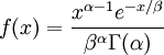
|
Note that  in the density function refers to the gamma function (which is distinct from the Gamma distribution). The gamma function is easy to calculate when its argument is a positive integer:
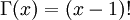
For example, the gamma function for the value 10 evaluates to 9! = 9*8*7*6*5*4*3*2*1 = 362,880 (you will use this fact a few minutes from now). When, however, the argument is an arbitrary positive real number (which is the usual situation for ), then computing it gets more complicated. Fortunately, R handles details like this for us!
if is known and the mean must be 1.0? answer never estimated when using the Gamma distribution to model among-site rate heterogeneity? answer if mean = 2 and variance = 4? answer if mean = 2 and variance = 4 (hint: use the value of you just calculated)? answerCreating a Histogram
Type the following command into the R console to generate 1000 random numbers (variates) from a Gamma distribution with shape=0.5 and scale=2.0 and store them in the variable x:
> x <- rgamma(1000, shape=0.5, scale=2.0)
The "r" in "rgamma" stands for "random". There is a corresponding "r" command for all the common probability distributions (e.g. rbeta, rbinom, rchisq, rexp, rnorm, runif) and in each case it allows you to draw a sample of values from that distribution (e.g. the beta, binomial, chi-square, exponential, normal and uniform distributions, respectively).
It may appear that nothing has happened, but you can view the 1000 values stored in the variable x by typing x at the prompt.
Creating a basic histogram from these 1000 values is easy:
> hist(x)
Now refine the histogram by asking R to give you 50 bars:
> hist(x, breaks=50)
Note that breaks represents a suggestion only. R will often be passive-aggressive and not give you exactly as many bars as you want.
Create a histogram with approximately 40 bars from 10000 variates from a Gamma(shape=10, scale=0.1) distribution.
Create a histogram with 30 bars from 10000 variates from a Gamma distribution in which the mean is 2 and the variance is 1 Assuming you have stored the 10000 variates in the variable x, type summary(x) to get the sample mean, median, etc.
Draw another sample with 1 million variates and summarize.
The results above make sense: the variance of one Gamma random variate is  , but the variance of the mean of
  Gamma random variates is
  . The variance of the mean is thus inversely proportional to the sample size, so the mean of 1 million Gamma variates was much closer to the expected value 2 than the mean of only 10000 variates.
Don't confuse rate with scale!
Only 2 parameters are required to fully specify a Gamma distribution, but the second parameter can be either the scale (what we've been using) or the rate (inverse of the scale parameter). Try this experiment, which will plot two histograms on the same plot (by using add=TRUE for the second invocation of hist):
> x <- rgamma(1000000, shape=5, scale=5)
> y <- rgamma(1000000, 5, 5)
> hist(x, breaks=50, main="", xlab="", xlim=c(0,80))
> hist(y, col="navy", border=NA, add=TRUE)
Plotting the density function
The "d" commands (e.g. dgamma, dbeta, dexp, dnorm, dunif) can be used to compute the probability density function for a series of values. In this part of the tutorial, you will use the dgamma function to compute the Gamma density function for all 501 values in the series 0.0, 0.01, 0.02, ..., 5.0. First, generate the values in the series and store them in a variable named x:
> x <- seq(0.0, 5.0, 0.01)
The seq generates a series of values starting at the first supplied value (0.0 in this case), stopping at the second supplied value (5.0 in this case), with spacing between values in the sequence determined by the third supplied value (0.01 in this case). To see if 501 values were generated, type
> length(x)
You can list all the values in x by simply typing x at the console.
R makes it easy to compute a quantity for every number in a list. Here is how to compute the Gamma density for each value stored in the variable x:
> y <- dgamma(x, shape=10, scale=0.1)
Before plotting the density function, you should convince yourself that R is computing the density correctly by calculating one value yourself by hand. First print out the 100th x value as follows:
> x[100]
The value displayed should be 0.99.
=10 and = 0.1 answerCompare your value to the value computed by R:
> y[100]
Now plot the density function as follows:
> plot(x,y)
This command says to plot all possible pairs of points, where one value is taken from x and the other from y. There are 501 values in both x and y, so 501 points will be plotted. This plot looks pretty ugly, with lots of overlapping points. Instead, let's connect the points with a line but not print all 501 points themselves. You can do this by adding type="l" to your plot command:
> plot(x,y,type="l")
The type is specified to be a lower case L character here (L for line). For other plot types, see the online help by typing:
> help(plot)
I nearly always want the lines in my plots to be thicker. Here is how to triple the thickness of the plotted line using the "lwd" (line width) setting:
> plot(x,y,type="l", lwd=3)
Finally, make the plotted line blue using the "col" (color) setting:
> plot(x,y,type="l", lwd=3, col="blue")
There is a very helpful PDF file showing many named colors at https://www.nceas.ucsb.edu/~frazier/RSpatialGuides/colorPaletteCheatsheet.pdf
Also, there are many other settings that affect plots. Get help on the par command to see these (just about any setting you can specify for par also works for plot):
> help(par)
Using the distribution function
We've seen the "d" and "r" commands (for density function and random number generation), but there are two additional standard commands defined for probability distributions. The "p" command computes the cumulative distribution function for a distribution. For the Gamma distribution, you can use the pgamma command to compute the integral of the density function up to a specified value. First, plot a Gamma density with shape 2 and scale 0.5:
> x <- seq(0.0, 5.0, 0.01)
> y <- dgamma(x, shape=2.0, scale=0.5)
> plot(x, y, type="l")
Compute the area under the density from 0 to 1 as follows using the pgamma command:
> pgamma(1, shape=2, scale=0.5)
[1] 0.5939942
Thus, nearly 60% of random draws from a Gamma(2,0.5) distribution would be less than 1.0. You can compute several cumulative probabilities by supplying a vector to the pgamma command. Suppose you wanted to know the cumulative probability for each of the values on the x-axis (i.e. 1, 2, 3, 4 and 5):
> pgamma(c(1,2,3,4,5), shape=2, scale=0.5)
[1] 0.5939942 0.9084218 0.9826487 0.9969808 0.9995006
Note that 5 values are produced by this command, corresponding to the 5 values supplied in the vector c(1,2,3,4,5). The last one (0.9995006) means that 99.95% of random draws from this distribution would be less than 5.0.
Quantiles
A quantile is a point along the x-axis of a density plot that corresponds to a particular cumulative probability. For example, the 60% quantile corresponds to a cumulative probability of 0.6. If you computed the area under the density curve up to some point x and the cumulative probability was 0.6, then x is the 60% quantile. For example, in the previous section, the value 1 is very close to the 60% quantile. Suppose we wanted to divide up a Gamma(2, 0.5) distribution into four equal-area pieces, and needed to find the points along the x-axis corresponding to the boundaries between these pieces (does this problem sound familiar?). We could do this in R as follows:
> qgamma(c(0.25, 0.5, 0.75, 1), shape=2, scale=0.5)
[1] 0.4806394 0.8391735 1.3463173
Note that we have supplied 4 values to the qgamma function via the vector c(0.25, 0.5, 0.75, 1). We did not actually need to supply the fourth value (1.0) because we know that the 100% quantile is equal to infinity. In case you haven't guessed, these would be the boundaries used if we applied discrete Gamma rate heterogeneity to a model, specifying 4 categories and shape=2.0.
You should check this in PAUP using PAUP's gammaplot command:
gammaplot shape=2 ncat=4;
So the pgamma command can be used to ask questions like "What are the chances that a Gamma(2,0.5) variate would be less than 1.0?" whereas the qgamma command is used to ask the related question "What interval accounts for 95% of the values drawn from a Gamma(2,0.5) distribution?"
Exponential distribution
The Exponential distribution is a special case of the Gamma distribution. Exponential distributions are Gamma distributions in which the shape parameter equals 1.0. The single parameter of an Exponential distribution is called the rate parameter and is the inverse of the scale parameter of the corresponding Gamma distribution. Like all other Gamma distributions, Exponential distributions range from 0.0 to infinity, so they provide excellent prior distributions for all the parameters for which Gamma distributions are appropriate (various relative rates and branch lengths). Exponential distributions are popular as priors because they force you to only come up with one number (the rate parameter) rather than the two (shape and scale) needed for Gamma distributions, but this does not in any way justify using Exponential distributions over Gamma distributions!
Here are some basic facts about the Exponential distribution:
| Rate | 
|
| Mean | 
|
| Variance | 
|
| Density function | 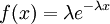
|
Exponential densities
Let's plot a couple of exponential densities and compare them. First, plot an Exponential(10) density function as follows:
> x <- seq(0.0,5.0,0.01)
> y <- dexp(x, rate=10)
> plot(x, y, type="l", col="blue", lwd=3, ylim=c(0, 10), xaxs="i")
Note that I've colored the line blue (col="blue"), made it thick (lwd=3), set the y-axis limits to 0.0 and 10.0 (ylim=c(0,10)) and specified that the x-axis limits should be adhered to srictly (no added 4% to the left and right ends).
Now let's add an Exponential(0.1) density (in red) to the plot using the lines function:
> y2 <- dexp(x, rate=0.1)
> lines(x, y2, col="red", lwd=3, ylim=c(0, 10), xaxs="i")
The lines command is like the plot command except that it adds a line to an existing plot rather than creating a new plot (also, notice that type="l" is neither necessary nor allowed because the lines command only generates lines). (As you might imagine, there is also a points command that adds points to an existing plot.)
Beta distribution
The Beta distribution differs from the Gamma distribution in that Beta random variables have an upper bound (1.0) as well as a lower bound (0.0). Two parameters (a and b, but often referred to as and ) govern the shape of the Beta distribution. Beta distributions are natural priors for parameters such as pinvar (and the proportion of heads parameter in coin flipping examples), which are restricted to the [0.0, 1.0] interval.
Here are some basic facts about beta distributions:
| shape parameter 1 | 
|
| shape parameter 2 | 
|
| Mean | 
|
| Variance | 
|
| Density function | 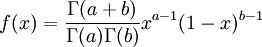
|
The  function above is the same one used in the Gamma distribution.
Symmetrical Beta distributions
Beta densities are symmetrical about 0.5 if a = b. Try plotting a Beta(3,3) distribution in R as follows:
> x <- seq(0.0, 1.0, 0.01)
> y <- dbeta(x, 3, 3)
> plot(x, y, type="l")
A somewhat easier way to make a plot (that we will use from this point onward) involves using the curve function. The curve function handles details like generating a list of x values to plot - you need only specify a "from" and "to" value for the x-axis. If you use a variable name not equal to x for the x-axis, then you also need to specify "xname". Below I am pretending that the plotted Beta distribution is my prior for the pinvar parameter:
> curve(dbeta(pinvar, 3, 3), from=0, to=1, xname="pinvar")
As a and b get larger (still constraining a to equal b), the density becomes more and more sharply peaked at 0.5. Generate the plot again, this time for a Beta(100,100) density. Let's also plot the Beta(3,3) density for comparison. Note the addition of add=TRUE to the second curve, which causes the second curve to be added to the first one (very handing for comparing two curves!):
> curve(dbeta(x, 100, 100), from=0, to=1)
> curve(dbeta(x, 3, 3), from=0, to=1, col="blue",lty="dotted", add=TRUE)
I did not need to specify xname="x" in either curve above because I used x as my x-axis variable (which is the default). I also made the second curve have a dotted, blue line by adding the line type (lty) and color (col) attributes to the command.
Note that if a = b, the variance formula given above simplifies to just 1/(8a + 4), so the variance of a Beta(3,3) distribution is 1/28 = 0.0357, whereas the variance of a Beta(100,100) distribution is 1/804 = 0.00124, which is 28.8 times smaller. My point here is just that "sharper" densities have smaller variances.
If a=b=1, the Beta distribution is identical to a Uniform(0,1) distribution, and the density function is simply a straight line at height 1.0:
> curve(dbeta(x, 1, 1), from=0, to=1)
This distribution might be useful for a coin-flipping analysis if you believed strongly that the world was full of trick coins (two-headed or two-tailed coins)!
Asymmetrical Beta distributions
If a is not equal to b, Beta densities are skewed to the right or left and are not symmetrical. Take a look at the formula for the mean: a/(a+b). If a < b, the mean is less than 0.5 and the Beta distribution leans to the left. If a > b, the Beta distribution leans to the right.
Calculate the mean and variance of a Beta(2,5) distribution using the formulas provided at the beginning of this section. Now sample 10000 values from a Beta(2,5) distribution and compute the sample mean and variance as follows:
> x <- rbeta(10000, 2, 5)
> mean(x)
[1] 0.2850546
> var(x)
[1] 0.02490558
Create a histogram of the values in x:
> hist(x)
Save the histogram as a PDF file named "beta25a.pdf" (we'll be using this file again in a minute). In the Plots window of RStudio, use the Export dropdown and choose "Save as PDF..." to save the file.
Relationship to the Gamma distribution
Beta distributions are related to Gamma distributions. If x is a Gamma(a,1) random variable, and y is a Gamma(b,1) random variable, then x/(x+y) is distributed as Beta(a,b). Now that you have just generated 10000 Beta(2,5) random variables, let's compare that to 10000 random variables generated as described above:
> xx <- rgamma(10000, 2, 1)
> yy <- rgamma(10000, 5, 1)
> z <- xx/(xx+yy)
> mean(z)
> var(z)
Note in line 3 that R automatically applies formulas repeatedly to each value of a list. Both xx and yy are lists of 10000 values. Line 3 produces 10000 values stored in z where z[i] = xx[i]/(xx[i] + yy[i]) for i = 1, 2, ..., 10000.
Create a histogram of the values in z, and save as a PDF file named "beta25b.pdf" (the procedure is described in the previous section). Compare "beta25a.pdf" with "beta25b.pdf" (they should be very similar because we have simply generated 10000 Beta(2,5) random variables in two different ways).
You can also plot the histograms on top of each other as follows (I've used the rgb (which stands for red, green, blue) for specifying colors so that I could add some transparency: the fourth argument to rgb after red, green, and blue is 0.2 (20% of fully opaque):
> hist(x,col=rgb(1,0,0,.2), breaks=30)
> hist(z, col=rgb(0,0,1,.2), breaks=30,add=TRUE)
The area in common will now be purplish (red plus blue), while areas that represent one or the other will be reddish or bluish in color.
Dirichlet distribution
Gamma distributions can be used as priors for branch lengths, relative rates, the among-site rate heterogeneity shape parameter and other parameters whose range of valid values is 0 to infinity. Beta distributions are good for proportions, such as pinvar, and parameters whose range is 0 to 1. What about base frequencies? The four base frequencies all lie between 0 and 1, but any prior distribution used for base frequencies must take account of the fact that the four base frequencies must add up to 1. The Dirichlet distribution is perfect for constrained proportions like this.
The Dirichlet distribution behaves in many ways like a Beta distribution. In fact, the Beta distribution is a special case of the Dirichlet distribution or, said another way, the Dirichlet distribution is a multivariate version of the Beta distribution. Think of the Beta distribution as a univariate distribution governing the proportion, p, where p and 1-p are subject to the same constraint as base frequencies (that they must add to 1). A Beta(a,b) distribution is thus equivalent to a Dirichlet(a,b) distribution. There are four base frequency parameters, so four Dirichlet parameters are needed (i.e., a Dirichlet(a,b,c,d) distribution) to create a prior appropriate for a vector of four base frequencies: 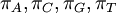 .
.
Here are some basic facts about the Dirichlet(a,b,c,d) distribution, specifically when used as a prior distribution for base frequencies:
| shape parameters 1, 2, 3, and 4, respectively | , ,  , , 
|
| sum of shape parameters (used in formulas below) | 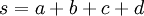
|
Mean of  , ,  , ,  , ,  , respectively , respectively
|

|
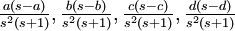
| Variance of , , , , respectively
|
|
| Density function | 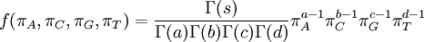
|
Relationship to the Gamma distribution
There are no rdirichlet, ddirichlet, qdirichlet, or pdirichlet functions in R, but it is easy to sample from a Dirichlet using the fact that, like the Beta distribution, the Dirichlet distribution is related to the Gamma distribution. If
(where is shorthand for " is a random number drawn from a Gamma distribution with shape and scale 1"), then a Dirichlet(a,b,c,d) random variable (a vector of 4 values) can be created by dividing each
  by the sum of all four values. Create 10 random Dirichlet(1,1,1,1) variables using this method and list them:
> x1 <- rgamma(10, 1, 1)
> x2 <- rgamma(10, 1, 1)
> x3 <- rgamma(10, 1, 1)
> x4 <- rgamma(10, 1, 1)
> s <- x1 + x2 + x3 + x4
> d <- c(x1/s, x2/s, x3/s, x4/s)
Note the use of the c(...) function to construct a vector of four values, each of which is one of the values divided by  , which is the sum of all four values.
Now display the 10 Dirichlet vectors:
> d
 [1] 0.09234290 0.37789542 0.08640752 0.28049539 0.14485492 0.05511074 0.14355295
 [8] 0.05358819 0.03350763 0.19362171 0.39036151 0.25134264 0.29663099 0.43909681
[15] 0.13981216 0.29531499 0.34553287 0.76487943 0.13311580 0.23832980 0.11153418
[22] 0.35743685 0.03021077 0.12139093 0.63609473 0.17125022 0.27907977 0.09122259
[29] 0.44937431 0.19609418 0.40576141 0.01332508 0.58675072 0.15901687 0.07923820
[36] 0.47832406 0.23183441 0.09030979 0.38400226 0.37195431
Unfortunately, R dumped all 10 vectors together, creating a single vector of 40 values! We can coerce R into displaying these 4 at a time by using the dim command to redimension d into a matrix with 10 rows and 4 columns:
> dim(d) <- c(10,4)
> d
            [,1]      [,2]       [,3]       [,4]
 [1,] 0.09234290 0.3903615 0.11153418 0.40576141
 [2,] 0.37789542 0.2513426 0.35743685 0.01332508
 [3,] 0.08640752 0.2966310 0.03021077 0.58675072
 [4,] 0.28049539 0.4390968 0.12139093 0.15901687
 [5,] 0.14485492 0.1398122 0.63609473 0.07923820
 [6,] 0.05511074 0.2953150 0.17125022 0.47832406
 [7,] 0.14355295 0.3455329 0.27907977 0.23183441
 [8,] 0.05358819 0.7648794 0.09122259 0.09030979
 [9,] 0.03350763 0.1331158 0.44937431 0.38400226
[10,] 0.19362171 0.2383298 0.19609418 0.37195431
Each row now represents a random draw from a Dirichlet(1,1,1,1) distribution. If we were using this Dirichlet distribution as a prior for base frequencies, each row would represent one representative vector of base frequencies from our prior. Given the impossibility of plotting a 4-dimensional density function, it would thus be useful to use the method above to produce samples from various Dirichlet distributions to see what they imply about the distribution of base frequencies.
To make it easier to explore the properties of Dirichlet distributions, let's put the commands you just entered into a function that can be called with different combinations of parameters. Copy the following into your clipboard and paste it into the R console window.
Dirichlet <- function(a,b,c,d) {
  x1 <- rgamma(10, a, 1)
  x2 <- rgamma(10, b, 1)
  x3 <- rgamma(10, c, 1)
  x4 <- rgamma(10, d, 1)
  s <- x1 + x2 + x3 + x4
  d <- c(x1/s, x2/s, x3/s, x4/s)
  dim(d) <- c(10,4)
  d
}
Symmetrical Dirichlet(a,b,c,d) distributions
Like Beta distributions, Dirichlet distributions are symmetrical if all parameters are equal. Use your new R function, which I've arbitrarily (but appropriately!) named "Dirichlet", to explore a series of symmetrical Dirichlet distributions:
> Dirichlet(1,1,1,1)
> Dirichlet(100,100,100,100)
> Dirichlet(1000000,1000000,1000000,1000000) # yes, that's 1 million!
In the case of a Dirichlet(a,b,c,d) distribution, as the parameters become larger (assuming  ), the density becomes more and more sharply peaked at (0.25, 0.25, 0.25, 0.25). The magnitude of the Dirichlet parameters thus determines the informativeness of the prior: if all four parameters equal 1, the Dirichlet is flat or uninformative (any possible combination of base frequencies has the same probability density as any other combination), whereas if all four parameters equal 1 million, then approximately equal base frequencies (e.g. 0.250241, 0.250133, 0.249963, 0.249663) get much more weight than very unequal base frequencies (e.g., 0.000404, 0.531065, 0.000002, 0.468529) and the distribution would be considered informative.
We can visualize these samples better by plotting them. Below is an R function that plots the four base frequencies in different colors (note that it draws 1000 samples rather than just 10):
PlotDirichlet <- function(a,b,c,d) {
 x1 <- rgamma(1000, a, 1)
 x2 <- rgamma(1000, b, 1)
 x3 <- rgamma(1000, c, 1)
 x4 <- rgamma(1000, d, 1)
 s <- x1 + x2 + x3 + x4
 d <- c(x1/s, x2/s, x3/s, x4/s)
 dim(d) <- c(1000,4)
 plot(1:1000, d[,1], type="l", col="red", ylim=c(0,1), ylab="frequencies")
 lines(1:1000, d[,2],col="blue")
 lines(1:1000, d[,3],col="green")
 lines(1:1000, d[,4],col="black")
}
The 1:1000 in the plot and lines commands is shorthand for seq(1, 1000, 1) (i.e., a sequence of values starting at 1, ending at 1000, with a step size of 1. Also, d[,1] means "the first column of d", d[,2] means "the second column of d, etc.
Now plot a few Dirichlet distributions:
> PlotDirichlet(1,1,1,1)
> PlotDirichlet(10,10,10,10)
> PlotDirichlet(100,100,100,100)
The x-axis in these plots doesn't have any meaning (it is just the row number of the matrix d), but looking at the plot it is easy to see which Dirichlet distributions have higher variance (and hence are less informative) and which have lower variance (and thus are more informative).
Asymmetrical Dirichlet distributions
If some of the four parameters differ from the others, Dirichlet(a,b,c,d) densities are not symmetrical. It might be useful to consider using asymmetrical Dirichlet distributions if you know your sequences are GC rich, for example. Here are three GC-rich Dirichlet distributions varying in informativeness but all having mean  :
:
> PlotDirichlet(2, 3, 3, 2)
> PlotDirichlet(20, 30, 30, 20)
> PlotDirichlet(200, 300, 300, 200)
Another way to view Dirichlet samples
Check out this approach to viewing 4-parameter Dirichlet distributions suitable for modeling nucleotide frequencies:
Dirichlet nucleotide frequencies prior applet
Dirichlet prior for GTR relative rates
As you know, the GTR model specifies six relative rates corresponding to the six possible types of substitutions in the rate matrix (actually there are 12, but the GTR model is symmetrical in that the relative rate for A to G substitutions is identical to that for G to A substitutions). Bayesian programs such as MrBayes typically use a 6-parameter Dirichlet(a,b,c,d,e,f) distribution as the prior distribution of these GTR relative rates.
Below is a revised Dirichlet function that takes 6 parameters rather than 4. Copy this into your R console:
Dirichlet <- function(a,b,c,d,e,f) {
  x1 <- rgamma(10, a, 1)
  x2 <- rgamma(10, b, 1)
  x3 <- rgamma(10, c, 1)
  x4 <- rgamma(10, d, 1)
  x5 <- rgamma(10, e, 1)
  x6 <- rgamma(10, f, 1)
  s <- x1 + x2 + x3 + x4 + x5 + x6
  d <- c(x1/s, x2/s, x3/s, x4/s, x5/s, x6/s)
  dim(d) <- c(10,6)
  d
}
Now apply the new function:
> Dirichlet(1,1,1,1,1,1)
> Dirichlet(1000,4000,1000,1000,4000,1000)
Now each row represents a set of GTR relative rates. The first case is a flat prior: it says that we have no idea which of six substitution classes we expect to be evolving at a relatively fast rate compared to the other substitution classes. The second case is an informative prior that says we expect the transition rate to be 4 times that of the transversion rate (assuming the ordering is  ).
).
Plotting trees in R
This section of the lab is a shortened version of the Ggtree lab written by former TA Kevin Keegan for the 2018 edition of EEB5349.
Goals
To give you a taste of what can be done with the R package ggtree for plotting phylogenetic trees.
Setup
Download tree file
Navigate to the folder you want to be working in for the R portion of the lab and download the tree file we'll be working with:
Install ggtree
Visit the Bioconductor page for ggtree and follow the instructions in the section labeled Installation to install the ggtree package. Here is what I typed in my R console within RStudio (but note that the instructions may have changed since I did this):
if (!requireNamespace("BiocManager", quietly = TRUE))
    install.packages("BiocManager")
BiocManager::install("ggtree")
This will end up installing several R packages: ggtree, treeio, tidytree, and ggplot2 (from which ggtree is derived).
Installing phytools
In addition to ggtree, we will also use the phytools package. Install this package using the Install button in the Packages panel of the output window within RStudio. Just type "phytools" into the Packages edit control and hit the Install button.
Importing packages
You can import the packages we need for todays lab into your R session either using the command line or the Packages panel of the output window in RStudio.
To use the command line, type (or copy/paste) these lines:
library("ggtree")
library("treeio")
library("phytools")
library("tidytree")
library("ggplot2")
To use RStudio, go to the Packages panel and click the checkbox beside each of these 5 packages. The search box can be used to easily find them if you don't want to do a lot of scrolling.
Reading and storing a tree
We're dealing with a tree in the Newick file format, which the function read.newick from the package treeio can handle:
tree <- read.newick("moths.txt")
(You may need to use the setwd command, described earlier, to set the working directory to the same directory in which you saved the moths.txt file.)
R can handle more than just Newick formatted tree files. To see what other file formats from the various phylogenetic software that R can handle checkout treeio. The functionality within treeio used to be part of the ggtree package itself, but the authors recently split ggtree in two with one part (ggtree) handling mostly plotting, and the other other part (treeio) handling mostly file input/output operations.
Creating a circle tree with two clades highlighted
Plot the tree using all default settings
Now plot the tree using the ggtree package:
ggtree(tree)
Note that ggtree has plotted just the tree itself, with no taxon labels. ggtree, by default, plots almost nothing, assuming you will add what you want to your tree plot. The grammar/logic of ggtree is meant to model that of ggplot2 and not the R language in general. The syntax of ggtree/ggplot2 makes them easily extendable and particularly useful for graphics, but is by no means intuitive to someone used to R's plot function.
Adding/Altering Tree Elements with Geoms and Geom-Like Functions
ggtree has a variety of functions available to you that allow you to add different elements to a tree. Many of them have the prefix "geoms" and are collectively referred to as geoms (which stands for "geometric objects"). We'll only go over some of them. You start with a bare bones tree and add elements to the tree, function by function, until you get the tree looking like you want it to. You'll see as we progress through this tutorial that visualizing trees in ggtree is a truly additive process.
Tip Labels
OK this tree would be more useful with tip labels. Let's add them using geom_tiplab:
ggtree(tree) + geom_tiplab()
This tree is a little crowded. You can expand the graphics window vertically to get it all to fit, but it might be better to do a circular tree:
ggtree(tree, layout="circular") + geom_tiplab()
OK that's a bit easier to work with. Those tip labels are nice but a little big. geom_tiplab has a bunch of arguments that you can play around with, including one for the text size. You can read more about the available arguments for a given function in the ggtree manual. Plot the tree again but with smaller labels (colored blue):
ggtree(tree, layout="circular") + geom_tiplab2(size=1,color='blue')
Notice we are using geom_tiplab2 and not geom_tiplab to show labels on the circular tree. The geom_tiplab2 function is specific to circular trees.
Saving to a PDF
We usually want to save the tree to a PDF file for use in a manuscript, so let's start doing that now. In order to save the tree to a file, you need to store it in a variable (we will call it t):
t <- ggtree(tree, layout="circular") + geom_tiplab2(size=1,color='blue')
Then you pass your tree variable on to the ggsave command:
ggsave(t, file="moth_tree.pdf", width=8, height=8)
The width and height are in inches, so I've sized it to fit nicely on a standard 8.5x11 inch letter-size page. But, you say, isn't 8 inches almost too wide? Circle trees in ggtree tend to leave some extra margin space (and apparently there is no way around this), so 8x8 scales the tree nicely for 8.5x11 paper.
Hint: You should get used to saving your tree to a PDF file and using that as the basis for further tweaking. Getting it to look good in the plot window may yield a tree that looks quite awful when printed (e.g. labels may be too big, lines may be too thick, etc.) Use the plot window as a crude guide, but when you get close, start saving to PDF and viewing what will actually be saved.
Storing geoms in variables
The geoms that add layers to your plot can also be stored in variables, making for cleaner, less-cluttered code. This also means that you have less pasting to do when you want to tweak a plot:
bluelabels <- geom_tiplab2(size=1,color='blue')
circletree <- ggtree(tree, layout="circular")
t <- circletree + bluelabels
ggsave(t, file="moth_tree.pdf", width=8, height=8)
Clean out your plot window periodically
Unbeknownst to you, each time you replot your tree (except when you use ggsave), the new plot gets drawn over the top of the previous plot. These plots pile up silently, leading to a lot of plot baggage in RStudio. Try clicking the red circle with a white X inside it in the toolbar of the plot window: you will see the blue-label version of your tree disappear and be replaced by the previous tree (with large black taxon labels). You can clean out all the old plots using the menu item Plots > Clear all... in the main menu of RStudio.
Now that we have everything stored in variables, you can replot your tree just by typing t!
t
Clade Colors
In order to label clades, we need to tell ggtree which nodes represent the root of each clade we want to label. To get the clade root node of interest, use the findMRCA function (find most recent common ancestor) from the phytools package. We will pass the function two arguments: the labels of two tips that, when traced back in time, serve to locate the root node of each clade of interest. In Keegan et al. (2019), the Amphipyrinae (as currently classified taxonomically) was found to be polyphyletic. Let's color two clades: one for the true Amphipyrinae, and one for a tribe (Stiriini) currently classified taxonomically in Amphipyrinae, that is far removed phylogenetically and thus has no business being classified within Amphipyrinae:
amphipyrinae_clade <- findMRCA(tree, c("*Redingtonia_alba_KLKDNA0031","MM01162_Amphipyra_perflua"))
stiriini_clade     <- findMRCA(tree, c("*Chrysoecia_scira_KLKDNA0002","*Annaphila_diva_KLKDNA0180"))
Now define a group that consists of the clades we want colored, and to tell ggtree that it should color the tree by according to the group.
tree <- groupClade(tree, c(amphipyrinae_clade, stiriini_clade), group_name = "group")
In the above line of code, we pass the tree object to the groupClade function. We are not overwriting tree and making it consist of only the Amphipyrinae and Stiriini clades, just defining clades within tree. Now if you were to execute ggtree(tree, layout="circular") the tree will still look the same. We need to amend the command to tell it to style the tree by the grouping of clades we just made called "group":
circletree <- ggtree(tree, layout="circular", aes(color=group, linetype="solid"))
The aes stands for aesthetics and is used to supply various attributes affecting the look of the plotted tree to ggtree. As you can see the tree gets colored according to some default color scheme. We can define our own color scheme. Let's call it "palette":
palette <- c("#000000", "#009E73","#e5bc06")
The values in palette are color values represented by a hexadecimal value. You can Google one of these hexadecimal values and a little interactive hexadecimal color picker will pop up. Feel free to pick two colors of your choosing to use in the palette -- but leave #000000 as it is. When you're designing a figure for publication, be sure to consider how easily your colors can be distinguished from each other by colorblind.
Now let's amend the ggtree command and tell it to use the colors we defined:
cladecolors <- scale_colour_manual(values = palette)
circletree <- ggtree(tree, layout="circular", aes(color=group, linetype="solid"))
circletree + cladecolors
Note that I've omitted tip labels from t to avoid clutter.
The order in which clades are colored is determined by the order of clades in the groupClade command. Every lineage in the tree not within a defined clade (i.e. within stiriini_clade or amphipyrinae_clade) is automatically colored according to the first palette value. The first defined clade (stiriini_clade) is colored according to the second palette value, and the second defined clade (amphipyrinae_clade) is colored according to the third palette value.
Clade Labels
Let's add some labels to the two clades. It's relatively straightforward now that we've already defined the clade root nodes:
a <- geom_cladelabel(node=amphipyrinae_clade, label="Amphipyrinae")
s <- geom_cladelabel(node=stiriini_clade, label="Stiriini")
circletree + cladecolors + a + s
OK, we should adjust the labels so they're not overlapping the grouping arcs, and let's hide the legend as it is really not adding anything:
a <-geom_cladelabel(node=amphipyrinae_clade, label="Amphipyrinae", offset.text=0.1)
s <- geom_cladelabel(node=stiriini_clade, label="Stiriini",offset.text=0.3)
nolegend <- theme(legend.position="none")
circletree + cladecolors + a + s + nolegend
Save the circle tree
Let's finish by saving the circle tree we've created to a file named circletree.pdf:
t <- circletree + cladecolors + a + s + nolegend
ggsave(t, file="circletree.pdf", width=8, height=8)
Plotting a rectangular tree with bootstraps
It is common to want to create a figure of a tree with at least the most important bootstrap/posterior probabilities indicated.
Let's start by adding node labels to a rectangular (as opposed to circular) tree. We will use the labels to show nodal support values (e.g. bootstraps) which are stored as node labels. We can display the node labels using geom_label.
recttree <- ggtree(tree, layout="rectangular",aes(color=group, linetype="solid"))
bootstraps <- geom_label(aes(label=label))
recttree + bootstraps + cladecolors + a + s + nolegend
You should see A LOT of node labels appear. Let's subset the node labels in order to just show the ones we want and reduce some of the clutter. We'll first create a dataframe from the data within tree:
q <- ggtree(tree)
d <- q$data
You can explore the structure of objects in the Environment window of RStudio. Try double-clicking on d to see what is now stored in that variable. You should see a table with headers parent, node, branch.length, label, group, isTip, x, y, branch, and angle. We will be using only the label and isTip columns. Note as you (slowly) scroll down the rows that the labels column includes taxon labels for tips as well as bootstrap values for internal nodes (and there are a couple of nodes - 155 and 156 - with empty labels).
We will use what, in R, is known as logical indexing to extract the subset of labels we want.
To select only internal nodes, try this:
ok <- !d$isTip
We've created a variable ok that is a vector of all rows in d for which isTip is FALSE. Type View(ok) to see what it looks like. You should see that ok has FALSE values up to element 155, after which all the elements are TRUE. Why is this?
Let's also filter out any nodes with bootstraps less than 90:
ok <- !d$isTip & d$label > 90
You can count how many TRUE values are in the ok vector using sum (which adds 1 for every TRUE value and 0 for every FALSE value):
sum(ok)
You can count the number of FALSE values using:
sum(!ok)
And you can count all values using:
length(ok)
Do the TRUE values and FALSE values add to the total count? If so, we are ready to subset our labels:
dsubset <- d[ok,]
highboots <- geom_label(data=dsubset, aes(label=label))
recttree + highboots + cladecolors + a + s + nolegend
The first line above selects only those rows of d for which ok is TRUE (that's logical indexing in action). The strange comma is necessary because d is a two dimensional data frame and we only want to mess with the row dimension.
The second line constructs a label geom that takes its data from dsubset rather than the tree's data object. We still need the aesthetics because we only want the label column from dsubset (if you double-click dsubset in the Environment panel you'll see that there is more there than just node labels; it contains just 25 rows of d but retains all of d's columns).
Scale Bar and Title
Create a scale bar using the scale bar geom. I've told it to place the scale bar at x=0 (left side; the x axis is measured in units of branch length) and y=12 (12 "taxa" up from the bottom; each unit of the y axis is equivalent to the distance between adjacent tip labels):
scalebar <- geom_treescale(x=0, y=12)
Create a title using ggtitle. Use it just like you would a geom:
title <- ggtitle("This is a Title")
Export Plot to PDF
t <- recttree + highboots + cladecolors + a + s + scalebar + title + nolegend
ggsave(t,file="bstree.pdf", width=7, height=10)
If the layout of your tree just isn't quite what you wanted, go back and play around with the geoms and geom-like functions until the PDF is to your liking. In particular, you may wish to modify your definition of the a and s clade labels to remove the offsets that we used for the circle tree.
Cite ggtree
Remember to cite ggtree if you use it in a published work!
citation("ggtree")
Getting Help
The Google Group for ggtree is fairly active. The lead author of ggtree chimes in regularly to answer people's questions -- just be sure you've read the documentation first, otherwise you may be told that he can't read it for you!
Speaking of documentation there is the ggtree manual, more accessible documentation, gallery of examples, and a couple of tutorial-like vignettes: Data Integration, Manipulation and Visualization of Phylogenetic Trees and Visualizing and Annotating Phylogenetic Trees with R+ggtree. Most recently, the lead author of ggtree released a comprehensive online book on ggtree.
References
Keegan, K, Lafontaine, JD, Wahlberg, N, Wagner, D (2019) "Towards Resolving Amphipyrinae (Lepidoptera, Noctuoidea, Noctuidae): a Massively Polyphyletic Taxon"." Systematic Entomology, 44, 451-464 http://dx.doi.org/10.1111/syen.12336
Yu G, Smith D, Zhu H, Guan Y and Lam TT (2017). “ggtree: an R package for visualization and annotation of phylogenetic trees with their covariates and other associated data.” Methods in Ecology and Evolution, 8, pp. 28-36. doi: 10.1111/2041-210X.12628, http://onlinelibrary.wiley.com/doi/10.1111/2041-210X.12628/abstract.